

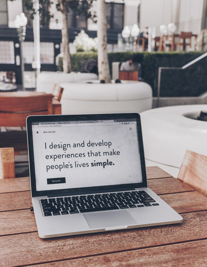
website design
In 2011, the American designer Ethan Marcotte proposed a website improvement plan in response to the coming of the "multi-screen era", adapting the screen size by fluid movement to adjust the web content, zoom, rearrange or hide some content. RWD has now become a web designer. The irreversible development trend and technical concept of the website, such a production concept can be called Responsive web design (RWD), also known as responsive, responsive, corresponding, multi-screen web design, but the design concepts are all identical. Before 2010, the websites built by web designers were mostly designed according to a certain precise size, such as 1024x768, similar to poster, newspaper, book design, etc. The size is fixed, but now has Dozens of different screen size specifications, such as smartphones, ipads and laptops, and many other screen sizes, web designers today are often troubled by too many screen sizes and ratios.
RWD web design (responsive), made with CSS3 technology, based on the concept of percentage and liquid elastic layout design, the web page itself will slide to hide and change with the size of the screen, and the corresponding changes will be generated in real time, so that the viewer You can browse in a comfortable state. Before the RWD web design (responsive) was not mature and popularized, mobile phone board websites were also popular for a short period of time. As a temporary solution for traditional websites and RWD websites, there are still many shortcomings that cannot be improved due to the use of mobile version websites. Nowadays, RWD web design (responsive) can use one website to replace multiple versions of the website. The production and management are relatively simple, so the mobile version of the website has gradually been replaced.
With the popularity of mobile devices, responsive web design is imperative.
According to the latest survey results released by the FIND of the Information Policy Committee, 16 million people have used smartphones or tablets in China. The survey also found that mobile devices are not only popular among middle- and low-age groups, but also that the penetration rate of middle- and senior-age groups is continuously increasing. Mobile devices are no longer just patents for young people, but also gradually enter the life of middle- and high-age groups. In addition to instant messaging, social networking sites, games, and sending and receiving emails, the most commonly used applications of these users on smartphones are also increasing in map navigation, searching for travel information, online shopping, and booking. For those who are highly dependent on the Internet and websites, if their websites are revised for mobile communities, they will be the biggest beneficiaries.
Design
Imagine when users browse your website through a mobile device, can they easily read the content of the page and find the information they need, or find it difficult to use?
The computer version of the website will cause inconvenience for mobile devices to browse and use. When users browse a website that has not been optimized for mobile devices, they have to swipe or zoom the screen with two fingers to read the content of the website, so if they feel inconvenient in using it, they may give up browsing your website. On the other hand, the version suitable for mobile device browsing is not only easy to read, but also extremely smooth and convenient to use.
In the US, 94% of smartphone users search local information on their phones. Interestingly, 77% of mobile device searches occur in the user's home or company, and these are places where there may be desktop computers.
As long as there are mobile phone users, any industry needs RWD responsive web design
With the increasing popularity of smartphones and tablets, everyone's browsing habits have changed, and web pages are no longer limited to being displayed on computers. According to the survey, at the end of 2014, the proportion of mobile devices on the Internet exceeded that of computers, so now the design of websites must take into account the convenience of browsing websites for mobile device groups.
The traditional method is to ask customers to design a mobile version of the website separately. If the old website is only for the mobile version without the entire re-production, it will cause the administrator to update the content of the web page twice. If it is not updated, Often cause unnecessary customer complaints!
RWD responsive web technology is imperative
Codesignx is very concerned about website design trends and constantly improves the technology of web development and design. It has introduced the Reactive (RWD) web design technology, which is recognized as one of the important advances in web development technology in 2013. This is a web page that automatically adjusts to the screen size, such as more comfortable layout, fonts, fonts, etc. As mobile devices become more and more diverse, technologies derived from consumers in order to obtain the same pleasant online experience on different mobile devices.
Abbey.com has now helped companies, companies, bed and breakfasts, online shopping, and more than one hundred customers to build websites using responsive web design (RWD) technology, and then launched a discount program to help all websites with the most favorable fees in the industry Manufacturers who design needs design responsive (RWD) websites to make them more popular.